
Sales Dashboard Software 2026: Top Picks for Sales Managers
TL;DR:
- Power BI, Tableau, Looker Studio, Klipfolio, and Geckoboard are top dashboard tools for sales analytics in 2026, each suited to different team sizes and needs. Selecting the right tool depends on data maturity, AI requirements, maintenance capacity, and security considerations. Prioritizing simple, well-integrated solutions with real data and proper onboarding accelerates trusted insights and decision-making.
The five tools worth trialing first: Power BI for Microsoft-native orgs, Tableau for teams with data resources and complex visualization needs, Looker Studio for Google-centric teams that want zero-cost dashboarding, Klipfolio for fast custom sales dashboards without heavy engineering, and Geckoboard for live floor visibility and TV-ready KPI displays. The dashboard software market is a multibillion-dollar industry with increasing enterprise adoption over recent years, reflecting a real shift in sales analytics priorities. That momentum shows sales leaders are moving from “what happened last quarter” to “what’s at risk right now.”
Three quick signals to guide your shortlist:
Jump to the comparison table below to scan pricing, integrations, and AI features side by side.
| Tool | Best For | Pricing (Starting) | Integrations | Real-Time Refresh | Ease of Use | Customization | AI Features | Deployment | Scalability | Support |
|---|---|---|---|---|---|---|---|---|---|---|
| Power BI | Microsoft-stack orgs | ~$10/user/mo (Pro) | 500+ connectors, native Excel/Teams | Near real-time (DirectQuery) | Moderate | High | Copilot, NLQ, anomaly detection | Cloud + on-prem | Enterprise-grade | Docs, community, paid support |
| Tableau | Data teams, advanced viz | ~$15/user/mo (Creator) | 100+ native, broad ecosystem | Near real-time (live connections) | Steep learning curve | Very high | Einstein AI, predictive analytics | Cloud + on-prem | Enterprise-grade | Dedicated CSM (higher tiers) |
| Looker Studio | Google-centric teams | Free | 800+ via Looker Studio connectors | Scheduled or live (Google sources) | Low barrier | Moderate | Limited (Google AI integrations) | Cloud only | Moderate | Community, Google support |
| Klipfolio | Operational teams, custom dashboards | ~$99/mo (team) | 400+ data sources | Hourly to near real-time | Low-moderate | High | Basic AI insights | Cloud | Mid-market | Onboarding, chat support |
| Geckoboard | TV/ops visibility, exec kiosks | ~$49/mo | hundreds of connectors | Real-time (most sources) | Very low | Moderate | Minimal | Cloud only | Small-mid | Email, docs |
| Databox | Fast KPI dashboards | Free tier; ~$47/mo | 100+ native connectors | Hourly to daily | Very low | Moderate | AI Assist (basic) | Cloud only | Small-mid | Chat, onboarding |
| Domo | Full-stack data + viz | Custom (enterprise) | 1,000+ connectors | Real-time | Moderate | High | Domo.AI, predictive | Cloud | Enterprise | Dedicated CSM |
| Grafana | Time-series, technical metrics | Free (OSS); ~$8/user/mo (Cloud) | extensive plugin library | Real-time | Moderate-high | Very high | Limited | Cloud + self-hosted | Enterprise-grade | Community, paid |
| Metabase | Small-mid teams, self-service BI | Free (OSS); ~$500/mo (Cloud) | SQL + 20+ native | Scheduled queries | Low | Moderate | Basic NLQ | Cloud + self-hosted | Small-mid | Community, paid |
| SimpleKPI | KPI tracking, TV displays | ~$149/mo | 30+ integrations | Daily to real-time | Very low | Low-moderate | Minimal | Cloud only | Small-mid | Email, onboarding |
Pricing reflects publicly listed starting tiers and changes frequently. Verify current rates directly with each vendor before procurement. Enterprise tiers are almost always negotiated per-seat or per-connector. AI features are rolling out rapidly across all platforms; confirm roadmap items in your demo.
The real talk: Gartner research shows sellers who partner with AI are 3.7 times more likely to meet quota. That stat should shape how you weight AI features in your evaluation, not just treat them as a nice-to-have checkbox.
Power BI is Microsoft’s BI platform, and if your team lives in Excel, Teams, or Azure, it’s the natural home for your sales dashboards. The Copilot integration lets managers ask natural-language questions against live pipeline data, and DirectQuery means dashboards can reflect CRM changes in near real-time. The connector library covers Salesforce, HubSpot, Dynamics 365, and hundreds more.
Best for: Mid-market to enterprise orgs on the Microsoft stack.
Starting at roughly $10/user/month (Pro), it’s one of the most cost-effective enterprise-grade options. Just budget for a data analyst or RevOps resource to own the data model.
Tableau is the gold standard for teams that need deep, custom visualization. If your sales org runs complex territory analysis, multi-dimensional pipeline views, or board-level revenue storytelling, Tableau’s drag-and-drop canvas delivers. Einstein AI adds predictive analytics and automated insights. The trade-off: BI-heavy platforms like Tableau require data teams and ongoing technical maintenance, and picking it without a data owner leads to stale dashboards when schemas change.
Best for: Data-mature teams with a dedicated analyst or BI engineer.
Creator licenses start around $15/user/month, but enterprise deployments typically run significantly higher.

Free, Google-native, and genuinely useful for teams already in Google Analytics, Google Ads, or BigQuery. Looker Studio connects to over 800 data sources via partner connectors, and sharing a dashboard is as simple as sharing a Google Doc. The ceiling is real, though: complex sales forecasting and multi-CRM data blending push it to its limits quickly.
Best for: Google-centric teams, early-stage companies, or anyone who needs a zero-cost reporting layer fast.
Databox is built for speed. Connect your CRM or marketing stack, pick a prebuilt KPI template, and you have a working dashboard in under an hour. The free tier supports three data sources, which is enough to validate the tool before committing. AI Assist adds basic anomaly flagging.
Best for: Small-to-mid sales teams that want fast KPI dashboards without a data engineer.
Paid plans start around $47/month. Good for teams that need visibility, not advanced analytics.

Klipfolio’s sales dashboard templates cover monthly sales performance, leaderboards, and TV displays, and the platform’s step-by-step build process is genuinely approachable for ops teams without engineering support. You can connect 400+ data sources and assemble a custom dashboard in a day. The leaderboard and TV display features make it a strong choice for sales floors that want live rep performance visible to the whole team.
Best for: Operational teams that want custom dashboards without heavy engineering overhead.
Team plans start around $99/month.
Geckoboard does one thing extremely well: it puts your KPIs on a TV screen in real time, with zero friction. Setup takes minutes, the interface is clean, and the displays are designed to be read from across a room. It’s not a BI tool and doesn’t pretend to be. If your goal is floor-level visibility and exec kiosk displays, it’s the fastest path there.
Best for: Live sales floor visibility, executive kiosks, and teams that want always-on KPI displays.
Starts around $49/month. Narrow use case, but it nails it.
Domo is a full-stack platform: data ingestion, transformation, and visualization in one product. That’s its core pitch. The Domo.AI layer adds predictive analytics, automated insights, and natural-language querying. For organizations that want to consolidate their data stack and dashboarding in one vendor, Domo is compelling. Pricing is enterprise and custom, which means it’s not the right call for a 10-person sales team.
Best for: Larger organizations that want data infrastructure and dashboarding from a single vendor.
Grafana is open-source and built for time-series data, which makes it a natural fit for teams tracking sales velocity, activity metrics, or engineering-linked revenue signals. The plugin ecosystem is extensive, and self-hosting keeps costs low. The catch: Grafana requires technical setup and ongoing maintenance. It’s not a tool you hand to a sales manager and expect them to configure.
Best for: Technical teams tracking time-series or engineering-linked metrics alongside sales data.
Cloud plans start around $8/user/month; self-hosted is free.
Metabase is the friendliest open-source BI tool for non-technical teams. The no-code question builder lets sales managers pull pipeline reports without writing SQL, and the SQL editor is there when analysts need it. Self-hosting keeps costs near zero for small teams. Basic natural-language querying is available in newer versions.
Best for: Small-to-midsize teams that want self-service analytics without a heavy BI investment.
Cloud plans start around $500/month; self-hosted is free.
SimpleKPI is purpose-built for KPI tracking and TV displays. The KPI library covers common sales metrics out of the box, and the interface is clean enough that non-technical managers can configure dashboards without training. It’s a narrow tool with a narrow use case, and that’s fine. Teams that need a simple, always-on KPI board without the complexity of a full BI platform will find it fits well.
Best for: Operational teams that prioritize KPI visibility over analytics depth.
Plans start around $149/month.
The decision comes down to four honest questions: What data do you actually have? Who will maintain the tool? What decisions must the dashboard drive? And what’s the real total cost?
Small teams (under 10 seats) can get started with Looker Studio (free), Databox (free tier), or Geckoboard (~$49/month). Mid-market teams typically land in the $100–$500/month range with Klipfolio, Metabase, or Power BI. Enterprise deployments with Domo or Tableau are custom-quoted and often run into five figures annually once connectors, training, and support are factored in.
Different roles need different views. Giving a rep the same dashboard as your CFO is a fast way to ensure neither uses it.
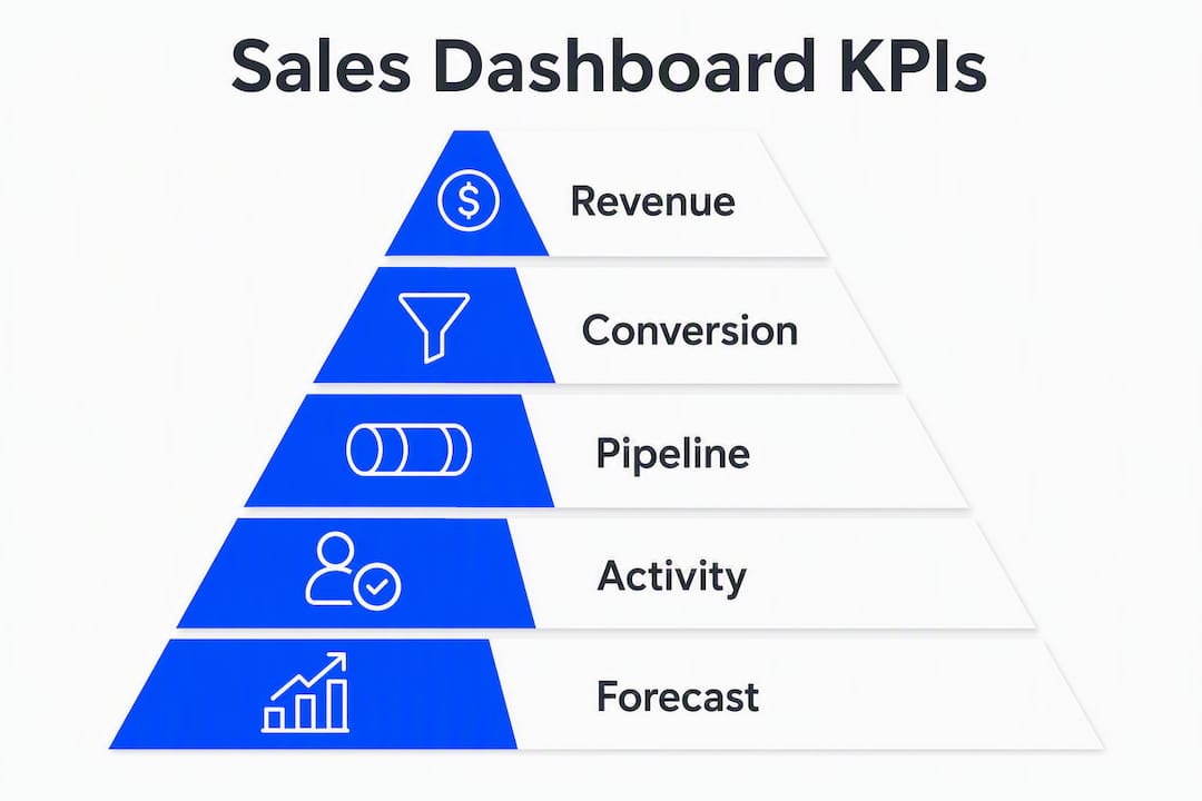
| Dashboard Type | Core KPIs | Refresh Cadence | Primary Action Triggered |
|---|---|---|---|
| Rep / Coach | Activities logged, pipeline coverage, open opportunities, next steps due | Real-time to hourly | Rep self-correction, manager coaching conversation |
| Team Manager | Win rate, average deal size, sales cycle length, quota attainment by rep | Daily | Pipeline review, resource reallocation |
| Executive / Board | Forecast accuracy, ARR, revenue vs. target, churn risk | Weekly | Strategic decisions, headcount planning |
| Pipeline & Forecast | Pipeline velocity, stage conversion rates, weighted forecast, at-risk deals | Daily to real-time | Forecast calls, deal intervention |
Revenue-ops experts note a 2026 shift toward predictive forecasting and automated insights for pipeline health, moving reporting from “what happened” to “what will happen.” That shift shows up most clearly in the pipeline and forecast dashboard type, where AI-generated risk scores and velocity trends are replacing static stage counts.
AI-embedded dashboard builders can auto-generate charts, written insights, and predictive trends, reducing build time from hours to minutes. In 2026, the features worth testing during trials are:
Run trials with your real CRM export and a week of live sync data. AI-generated insights only become trustworthy when trained on current, clean pipeline data. Demo data will always look better than yours.
Pro Tip: Sketch your dashboard on paper first. Start with the single most important KPI for each role, wire the drill path, then connect real data. Klipfolio recommends this approach explicitly, and it’s the fastest way to reduce scope creep and avoid vanity metrics crowding out the signals that actually drive decisions.
The shortlist was built on seven criteria, weighted in this order:
Each tool was evaluated by trialing with a sample CRM export, checking default dashboard quality, running a basic forecast scenario, measuring setup time to a working dashboard, verifying export and embed options, and assessing AI insight outputs against real pipeline data. Pricing was verified against publicly listed tiers at the time of writing; it changes frequently, so confirm current rates directly with vendors. Regional availability and product roadmaps also shift, so a live trial with your own pipeline data before committing is the only reliable test.
Time-to-value varies more than vendors admit. Geckoboard and Databox can deliver a working dashboard in under two hours for a team with clean data. Klipfolio typically takes a day or two to configure custom views. Power BI and Tableau require a structured onboarding process, often spanning two to four weeks for a first production dashboard, and that timeline assumes a data analyst is available to own the data model.
Domo includes dedicated customer success management at enterprise tiers, which accelerates deployment but also reflects the complexity of the platform. Grafana and Metabase, when self-hosted, put the full onboarding burden on your internal team.
The honest reality: most teams underestimate the data preparation phase. Cleaning a CRM export, defining metric logic, and aligning on KPI definitions across sales, RevOps, and finance often takes longer than the tool configuration itself. Budget two to three weeks for data prep before your first dashboard goes live, regardless of which tool you choose.
Training support also varies. Looker Studio relies on Google’s documentation and community forums. Power BI has an extensive learning ecosystem including Microsoft Learn. Tableau offers structured certification paths. Klipfolio and Databox provide onboarding calls and chat support. For teams without a dedicated BI resource, the quality of vendor onboarding support is often the deciding factor between a dashboard that gets used and one that gets abandoned.
Customization depth and user experience are where the tools diverge most sharply. Tableau and Power BI offer the most design freedom: pixel-level control over layouts, custom color schemes, calculated fields, and role-specific views. The trade-off is complexity. Building a polished Tableau dashboard from scratch requires skill that most sales ops teams don’t have in-house.
Klipfolio sits in a useful middle ground. The template library covers the most common sales dashboard types, and the drag-and-drop builder lets ops teams customize without engineering support. Geckoboard and SimpleKPI prioritize simplicity over flexibility: you get clean, readable displays with limited layout control, which is exactly right for TV dashboards and exec kiosks.
User roles and permissions matter more than most buyers check during demos. Ask specifically: Can you restrict a rep to their own data only? Can a manager see their team but not other teams? Can an exec view aggregate data without accessing individual deal details? Power BI, Tableau, and Domo handle row-level security well. Looker Studio’s sharing model is simpler and less granular. Geckoboard and SimpleKPI have basic permission controls suited to their use cases.
A multi-layered approach often wins: CRM-native tools for daily rep activity plus a central BI layer for cross-department reporting. Many mature sales orgs run Salesforce or HubSpot dashboards for reps and a Power BI or Tableau layer for executive and cross-functional reporting. That architecture avoids forcing one tool to serve every audience.
Sales data is sensitive. Pipeline figures, deal values, customer names, and rep performance data all carry risk if exposed. Before signing any contract, confirm these specifics:
SOC 2 Type II certification is the baseline for cloud-hosted tools handling business data. Power BI, Tableau, Domo, and Klipfolio all carry SOC 2 certifications. Verify the current certification status directly with the vendor, as certifications lapse and scope varies.
GDPR and data residency matter if your pipeline includes EU prospects or customers. Some platforms offer EU data residency as an add-on; others default to US-based hosting. DataLion, for example, advertises ISO 27001 hosting and GDPR compliance explicitly for sales analytics use cases. Confirm where your data is stored and processed before signing.
Role-based access control (RBAC) and SSO are non-negotiable for teams of any meaningful size. SSO via SAML or OAuth reduces credential risk and simplifies offboarding. RBAC ensures reps see only their data, managers see their team, and executives see aggregate views. Confirm both are included in your tier, not locked behind an enterprise add-on.
Audit logs and data export rights are often overlooked until they matter. Can you export all your data if you switch vendors? Is there an audit trail of who accessed which dashboard and when? These questions belong in your security review, not your feature checklist.
For teams in regulated industries or with enterprise procurement requirements, ask vendors for their security documentation, penetration test summaries, and data processing agreements before the final decision.
The most effective sales dashboard strategy in 2026 pairs a low-friction tool your reps will actually use with AI-assisted forecasting your leadership team can trust.
| Point | Details |
|---|---|
| Match tool complexity to data maturity | Simple tools like Geckoboard or Databox suit clean CRM data; Tableau and Power BI require a data owner to stay current. |
| AI features need real data to work | Trial AI insights with your actual CRM export, not vendor demo data, before committing to a platform. |
| Budget for data prep, not just licenses | Most teams spend two to three weeks on CRM cleanup and KPI definition before a first dashboard goes live. |
| Layer your dashboard architecture | CRM-native views for reps plus a BI layer for executives often outperforms a single “enterprise” tool for all audiences. |
| Saleslabelconsulting accelerates the path | For mid-market and enterprise teams, a short consulting engagement covers KPI definition, data model mapping, and vendor selection before you commit. |
Here’s the honest decision flow, and it’s simpler than most vendors want you to think.
If you’re a small team with a clean CRM, defined KPIs, and a RevOps person who can own the data model, just pick a tool and trial it. Looker Studio costs nothing. Databox has a free tier. Geckoboard takes two hours to configure. Ship it, learn from real data, and iterate.
If you’re a mid-market team with partial data hygiene, competing metric definitions across sales and finance, and a VP of Sales asking for forecast accuracy, a short consulting engagement will save you months. The tool selection is the easy part. The hard part is agreeing on what “pipeline coverage” means, cleaning three years of CRM data, and building a data model that doesn’t break every time a sales stage gets renamed. That’s where most self-serve implementations stall.
Enterprise teams with cross-departmental reporting needs, multiple CRMs, and board-level dashboards should consult before they buy. The wrong tool choice at enterprise scale is expensive to unwind. A four-week architecture engagement that maps your data sources, defines your KPI taxonomy, and recommends the right platform tier will pay for itself in avoided rework.
The pitfalls to budget for, regardless of team size: data model rework when CRM fields change, user adoption gaps when dashboards aren’t tied to rep workflows, and integration failures when a connector doesn’t support the sync frequency you assumed. None of these are tool problems. They’re process and architecture problems that show up after the license is signed.
There are solid tools in this list. Power BI, Klipfolio, Tableau, and Domo will all get you to a working dashboard eventually. But “eventually” is the problem. Most mid-market and enterprise sales teams spend three to six months on tool selection, data cleanup, and failed first builds before they get a dashboard their leadership team actually trusts.
Saleslabelconsulting runs focused sales enablement engagements that compress that timeline. A typical four-week pilot covers dashboard architecture, KPI definition aligned across sales and finance, data model mapping from your CRM, vendor selection support, and a first production dashboard your team can use on day 30. The engagement also includes an adoption playbook so the dashboard doesn’t get abandoned two months after launch.
This is the alternative to buying a tool, spending weeks on setup, and realizing your CRM data isn’t clean enough to trust the output. If you’re a Head of Sales, VP of Sales, or RevOps leader at a B2B tech company, book a conversation with Saleslabelconsulting to scope what a short engagement would deliver for your team.
Pricing tiers, AI feature availability, connector lists, and security certifications change frequently. Before procurement, check these directly:
What to recheck before signing any contract:
This article reflects publicly available information at the time of writing. Pricing, features, and certifications change. Always verify current details directly with vendors and confirm compliance requirements with your legal or security team before procurement.
Subscribe to our Insights: Expert productivity tips in your inbox
You'll receive 1-3 emails per month. Your data stays private, always.

CRO & Co-Founder with Sales Label Consulting

Watch our Sales Mates Podcast
August 3, 2026 - 10 min read
Read article Read articleAugust 2, 2026 - 9 min read
Read article Read articleAugust 1, 2026 - 10 min read
Read article Read articleJuly 31, 2026 - 13 min read
Read article Read article